
Top 10 Brand Imagery in Dubai for Modern Businesses You Can Trust
Introduction
Brand imagery is more than just how a brand looks—it’s how a brand feels, connects, and is remembered. In today’s digital landscape, visual identity defines first impressions, reinforces trust, and strengthens emotional connection.
Our Marketing Agency Ranking Methodology
- Strategic Expertise – 25%
- Campaign Performance – 20%
- Creative Innovation – 15%
- Client Portfolio – 15%
- Industry Reputation – 15%
- ROI Focus – 10%
Scoring logic: Agencies are ranked based on strategy depth, campaign success, creativity, and measurable business impact.
According to a Lucidpress study, “consistent brand presentation across all platforms increases revenue by up to 23%”. Whether it’s the repetition of a color scheme, curated photography, or strategic typography, visual branding shapes how customers perceive and engage with your business.
This guide breaks down the components of brand imagery, how to build a cohesive visual identity, and where Dubai’s top agencies excel in making brands visually unforgettable.
To benchmark your own approach, explore this expert-curated list of Visual Branding & Design Agencies in Dubai.
Top 10 Brand Imagery in Dubai
Dubai is home to some of the most progressive and culturally nuanced branding agencies in the world. Here are 10 standout firms that are redefining visual storytelling through strategic design, each with a unique visual style and industry focus:
1. Octopus Marketing
Website : https://www.octopusmarketing.agency/
Visual Style: Immersive digital branding. Combines local culture, Arabic calligraphy, animations, and storytelling into interactive brand journeys.
Strengths: Corporate storytelling, education, regional startups.
Why They’re Notable: Unique for blending brand strategy with motion-first visual identity systems.
2. Red Marrow
Website : https://www.marrow.red/
Visual Style: Cinematic, emotionally evocative, and rich in editorial quality. Strong use of lighting, layering, and artistic typography.
Strengths: Fintech, luxury, health & wellness.
Why They’re Notable: Their visuals look like film stills—making even conservative sectors feel compelling and high-end.
3. Brand Lounge
Website : https://www.brandloungeme.com/
Visual Style: Premium minimalism. Heavy use of white space, elegant serif fonts, and luxury textures.
Strengths: Real estate, personal branding, C-suite executives.
Why They’re Notable: They bring timeless elegance to regional brands seeking global polish.
4. Skyne
Website : https://www.skyne.com/
Visual Style: Emotional storytelling with cultural relevance. Uses rich textures, traditional motifs, and storytelling-focused layouts.
Strengths: Government entities, museums, heritage brands.
Why They’re Notable: They seamlessly blend UAE’s heritage with contemporary design.
5. Grow
Website : https://www.grow.ae/
Visual Style: Clean, green, and purposeful. Uses soft colors, environmental textures, and sustainable design ethics.
Strengths: NGOs, sustainability-focused startups, organic product brands.
Why They’re Notable: One of the few agencies with a full eco-conscious design philosophy.
6. Prototype
Website : https://www.prototype.ae/
Visual Style: Sleek and functional. Combines UI screenshots with lifestyle shots and product-focused clarity.
Strengths: Fintech, enterprise SaaS, UX-driven projects.
Why They’re Notable: Merges UX strategy with visual branding better than most tech-first firms.
7. NNC Agency
Website : https://www.nnc.ae/
Visual Style: Editorial and high-gloss. Utilizes magazine-style layouts, dramatic lighting, and minimalist overlays.
Strengths: Fashion, cosmetics, luxury retail.
Why They’re Notable: Their visuals feel like luxury fashion spreads with a strategic edge.
8. Hulexo
Website : https://www.hulexo.com/
Visual Style: Clear, crisp, and product-centered. Focuses on conversion-optimized visuals like app screenshots and flat-lays.
Strengths: eCommerce, logistics, food delivery apps.
Why They’re Notable: Perfect for brands needing clarity and visual trust on transactional platforms.
9. Blue Beetle
Website : https://www.bluebeetle.ae/
Visual Style: Bright, friendly, and human-centered. Uses illustrations, infographics, and soft tones.
Strengths: F&B, education, family entertainment.
Why They’re Notable: Their approach feels approachable and fun, yet rooted in strong UX.
10. EIC Agency
Website : https://www.eic.agency/
Visual Style: Data meets drama. Specializes in kinetic visuals, infographic animations, and storytelling through motion.
Strengths: Government, tech, real estate.
Why They’re Notable: Their strength is turning dry data into visual narratives with impact.
What Is Brand Imagery?
Defining the Visual Side of Brand Identity
Brand imagery refers to the complete visual ecosystem a brand uses to communicate with its audience. This includes everything from photography, illustration, icons, and videos to typography, textures, shapes, and color palettes. It’s not just about aesthetics—it’s about how visuals convey brand personality, values, and promises without saying a word.
While brand identity is the umbrella term encompassing the logo, voice, mission, and values, brand imagery is the silent communicator within that system. It speaks through emotion, memory, and design. Think of it as your brand’s body language.
A brand’s imagery tells people:
- What kind of experience they can expect.
- Who the brand is for (e.g., bold and rebellious vs. soft and nurturing).
- Why the brand is different from competitors.
Why It Matters Beyond Aesthetics
First impressions are 94% visual. A user’s perception of your brand is largely formed in milliseconds, based on visual cues. Brand imagery is essential for:
- Building trust: A coherent, polished visual identity suggests professionalism and reliability.
- Enhancing recall: Visual consistency improves brand memory.
- Eliciting emotion: Colors, shapes, and photos activate emotional responses tied to decision-making.
- Guiding user behavior: Imagery cues where to look and how to feel on a page or ad.
A Harvard study found that 95% of purchasing decisions are subconscious. This makes emotional visual cues critical to conversions.
Pro Tip: Don’t confuse imagery with decoration. Every element must serve a brand function—if it’s not reinforcing personality or usability, it’s clutter.
Core Components of Brand Imagery
Color Palettes That Speak
Color is the fastest visual element people process. It builds brand recognition and emotional connection instantly. For example:
- Red can convey urgency, excitement, or danger.
- Blue suggests trust, calm, or professionalism.
- Green evokes nature, growth, and wellness.
Choosing a distinct, intentional palette reinforces a brand’s tone and differentiates it in the market.
According to a University of Loyola study, color increases brand recognition by up to 80%.
Visual Tip: Limit your brand palette to 3–5 colors and document use-cases for each (backgrounds, accents, calls to action, etc.).
Typography as a Brand Voice
Fonts carry subconscious meaning:
- Serifs feel traditional and authoritative.
- Sans-serifs are modern and clean.
- Display fonts express personality or edge.
Good typography creates a visual rhythm and hierarchy that makes your content digestible—and on-brand.
Best Practice: Choose two fonts: one for headings, one for body copy. Define rules for size, weight, and spacing in your brand style guide.
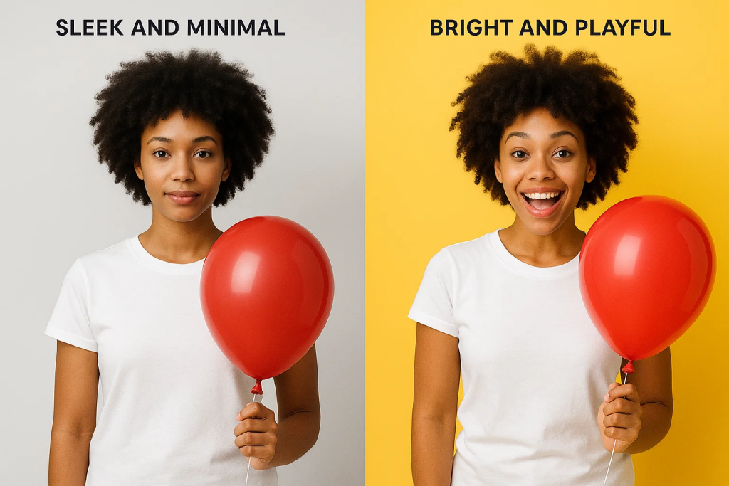
Photography & Style Guides
Photography is one of the most influential aspects of visual branding. It should consistently reflect brand personality through:
- Subjects (diverse, relatable, aspirational)
- Composition (minimalist vs. dynamic)
- Lighting (natural, moody, high-contrast)
A consistent visual tone helps your brand feel cohesive across all platforms—from Instagram to packaging.
Iconography, Textures, and Illustrations
These micro-elements subtly define your brand’s style language. Examples include:
- Custom icons for apps or site navigation.
- Branded textures like grain or gradients.
- Illustrative elements like hand-drawn arrows or doodles.
These should complement your primary visuals and never feel generic or mismatched.
The Psychology Behind Brand Imagery
Visual Memory and Emotional Recall
Humans are visual creatures by nature. Studies have shown that people remember 80% of what they see, compared to only 20% of what they read and 10% of what they hear. This makes imagery the most efficient and emotionally resonant tool for brand communication.
Visual memory isn’t just about recognition—it’s about connection. When a customer sees the same color palette, photography style, or graphic pattern across different platforms, their brain forms an emotional shortcut to that brand. It becomes familiar, and familiarity breeds trust.
This process is called emotional imprinting. It’s why you instantly recognize Apple from a white background and minimal photography, or Coca-Cola from red, curved lines, and a festive feeling. These brands have invested years in shaping their image through strategic, consistent imagery.
A brand that uses visuals effectively doesn’t just create brand awareness—it creates brand affinity. The audience doesn’t just recognize the brand; they feel something when they do.
According to neuroscientist Antonio Damasio, “We are not thinking machines that feel, we are feeling machines that think.” Emotion, not logic, drives buying behavior.
Practical Tip: Review your current visual assets. Do they consistently elicit the same emotion across ads, website, packaging, and social? If not, you’re missing an opportunity to deepen emotional recall.
Case Study: Apple vs. Android Visual Strategy
Let’s break down two dominant tech brands: Apple and Android, both offering similar functionalities but appealing to users through radically different imagery strategies.
Apple
- Uses minimalist photography with clean backgrounds and high contrast.
- Dominated by white space, which symbolizes elegance and focus.
- Highlights products with perfect lighting and symmetry, evoking precision and luxury.
- Consistency across packaging, stores, ads, and website creates a premium emotional experience.
Android
- Uses modular design, reflecting flexibility and user customization.
- Leverages vibrant color blocks, suggesting playfulness and inclusivity.
- Promotes visual diversity with a broader range of image styles and illustrations.
Both are effective, but for different reasons:
- Apple’s imagery appeals to those who value sophistication, simplicity, and control.
- Android’s visuals attract audiences that favor variety, openness, and energy.
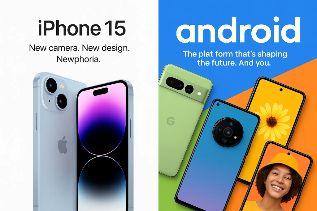
Takeaway: Imagery isn’t about aesthetics alone—it’s a psychological signal. Decide what emotion you want your brand to consistently evoke, then ensure your imagery aligns.
How to Create Brand Imagery That Resonates
Step 1: Define Your Brand Personality
Before designing anything, articulate your brand’s personality as if it were a person. Ask:
- What are its values?
- How does it speak?
- What does it wear?
- How does it make people feel?
This creates emotional and creative alignment between your brand’s internal identity and its external expression. Choose 3–5 adjectives (e.g., bold, nurturing, minimalist, rebellious) to guide your imagery tone.
For example, a skincare brand that chooses “clean,” “trustworthy,” and “refreshing” might opt for soft blues, natural lighting, and minimal photography.
Quote
“We hired a designer before knowing our brand personality—ended up with visuals that looked great but didn’t match who we were.” – r/branding
Step 2: Build a Moodboard
A moodboard translates abstract personality traits into tangible inspiration. You can use tools like:
- Canva’s Brand Kit
- Milanote
Include
- Color swatches
- Textures (metallic, matte, organic, etc.)
- Fonts
- Product photography
- Editorial visuals or architecture
Patterns will emerge. Are your images mostly neutral? Do they favor close-ups or wide angles? That’s your brand’s visual direction taking shape.

Step 3: Create or Commission Visual Assets
Based on your moodboard, you can now brief a designer or photographer. Here’s how to do it right:
- Share your brand adjectives.
- Include competitor imagery and what you like/dislike.
- Describe your ideal customer.
- Provide sample use-cases (e.g., social banners, website hero images).
If you’re working with freelancers or agencies, platforms like 99designs offer vetted talent matched to your style.
Checklist for Vetting Designers
- Do they understand your audience?
- Can they explain their choices in typography, color, and layout?
- Do they have experience in your industry or a complementary one?
Step 4: Create a Visual Style Guide
Your style guide is the operating manual for your brand imagery. It ensures consistency, especially when your brand grows or you collaborate with external creators.
What to Include
- Approved logo versions (horizontal, vertical, on light/dark)
- Color palette with hex/RGB/CMYK values
- Font pairings and usage rules
- Photography guidelines (angles, subjects, lighting, do/don’t)
- Iconography style and illustration themes
- Sample layouts or mockups
Browse examples on Behance to see how top brands structure theirs.
Pro Tip: Host your guide in a tool like Notion, Frontify, or Canva Brand Hub so it’s always accessible.
Avoiding Common Pitfalls
Inconsistency Across Channels
A frequent branding failure is when a brand’s Instagram looks like it belongs to a different company than its website or packaging. This fractures the customer experience, leading to confusion and distrust.
Why it happens
- Using different creators or tools without brand guidelines.
- Copy-pasting visual trends without alignment.
- Prioritizing speed over cohesion.
How to fix it
- Create templates for each platform (social, ads, presentations, packaging).
- Use a shared brand kit in tools like Canva Pro or Figma.
- Conduct a quarterly audit of your content library for off-brand visuals.
“It wasn’t until we standardized our Instagram colors and fonts that engagement finally clicked. People started recognizing us.” – r/startups
Pro Tip: Use one brand-defining image or layout per channel that sets the tone. Make it your “visual anchor.”
Stock Photo Syndrome
Stock photos are useful, but overused or poorly chosen images damage brand credibility. The issue isn’t using stock—it’s using unbranded, cliché, or irrelevant stock.
Signs of bad stock imagery
- Over-smiling business people with white teeth.
- Inconsistent lighting or colors vs. your brand tone.
- Zero resemblance to your target audience.
Alternatives
- Invest in a custom photo shoot—even one day can yield months of content.
- Use curated, premium stock libraries like:
- Death to Stock
- Pexels (filtered by tone)
- Unsplash (with brand-aligned filters)
Pro Tip: Use overlays, duotones, or branded templates to stylize stock photos so they feel native to your identity.
Real-World Brand Imagery Examples
Before & After: Visual Makeovers
Sometimes the best way to understand the power of brand imagery is to see what happens before and after a brand reinvents itself. Let’s look at two standout examples:
Airbnb: From Utility to Emotional Connection
Before 2014
- Visuals were cartographic and utilitarian.
- Blue color palette suggested a sterile, generic travel company.
- Stock photos lacked emotional depth or authenticity.
After 2014 Rebrand
- Introduced the “Bélo” symbol—a universal sign of belonging.
- Switched to warm, user-generated photography.
- Adopted soft pinks, beiges, and whites to humanize the brand.
- Promoted real hosts and guests to make the imagery emotionally relatable.
“Airbnb realized people weren’t just booking rooms—they were seeking belonging. Their imagery now reflects that emotional journey.” – branding strategist Debbie Millman
Mailchimp: Embracing Playfulness and Personality
Before 2018
- Clean but generic tech visuals.
- Conservative palette of blues and greys.
After 2018 Rebrand
- Introduced bold yellow as its signature color.
- Integrated quirky, hand-drawn illustrations and editorial-style photography.
- Reinforced their brand as one for creative entrepreneurs, not corporate users.
- Every element—buttons, icons, CTAs—became an extension of their cheerful, irreverent tone.
Maintaining a Consistent Look
Why Consistency Is Everything
Consistency in brand imagery isn’t just about aesthetics—it builds trust, recall, and revenue. In fact, the same Lucidpress study confirms that consistent branding across platforms can increase revenue by 23%.
When your Instagram, email banners, website, and packaging all “look and feel” like the same brand, users begin to develop subconscious brand loyalty. This visual continuity helps your audience:
- Recognize your brand instantly
- Feel safe and reassured, knowing what to expect
- Differentiate your message in a saturated market
A consistent visual identity is like a familiar face in a crowded room—it gives your audience a reason to remember and choose you.
Tools to Keep You On-Brand
Maintaining visual alignment across multiple channels and collaborators requires the right systems. Here are the top tools and methods:
1. Canva Pro Brand Kit
- Store colors, logos, and fonts
- Apply brand rules across presentations, social posts, and ads
- Great for non-designers in marketing teams
2. Figma Libraries
- Ideal for design and product teams
- Create reusable branded components (buttons, icons, layouts)
- Enables version control and collaboration
3. Frontify / Zeroheight
- Full visual brand guideline hosting
- Include usage do’s/don’ts, downloadable assets, and real-life examples
- Helps agencies, freelancers, and internal teams stay on the same page
4. Trello or Notion Boards
- Organize asset libraries by format or campaign
- Assign update responsibilities (e.g., “Q3 Visual Audit”)
Pro Tip: Assign a “brand sheriff”—someone responsible for approving all outgoing visuals. This role prevents off-brand experiments from slipping through, especially during fast launches.
Advanced Strategies: Brand Imagery in Marketing Campaigns
Seasonal Imagery Without Losing Core Identity
It’s tempting to jump on every holiday trend, but your brand’s visuals should never feel like a costume. Great seasonal branding adapts while maintaining its DNA.
Key Rule: Think of seasonal design as a filter, not a replacement.
How to do it well
- Retain your core elements (colors, logos, typography).
- Introduce temporary overlays or motifs (e.g., snowflakes, hearts, confetti).
- Use mood shifts in photography—cozy lighting in winter, vibrant outdoors in summer.
- Keep holiday messaging consistent with your brand voice.
Example: Starbucks maintains its signature red, green, and logo even when introducing playful seasonal cup illustrations. The theme changes, but the identity remains.
Omnichannel Brand Imagery
Your audience interacts with your brand in more than one place—Instagram, websites, emails, in-store, and beyond. Each channel has its format, but your visuals should tell one coherent story.
Omnichannel consistency strategy
- Social Media: Use lifestyle imagery and behind-the-scenes visuals to humanize your brand.
- Email Campaigns: Keep visuals clean, clickable, and optimized for mobile—include product shots or animated icons.
- Website: Balance lifestyle visuals with product-centric clarity. Use banners that echo your social tone.
- Packaging: Make it an extension of your digital look. Think textures, typography, and color blocking.
- Ads: Align layout, imagery, and tone with your landing page. Nothing breaks trust faster than a mismatch.
FAQ
1. What is brand imagery vs brand identity?
Brand imagery refers to all the visual components of your brand—photos, graphics, typography, colors, and icons—that visually express your personality and promise. Brand identity includes imagery plus verbal and strategic elements like mission, tone of voice, values, and messaging.
Think of brand identity as the full outfit (voice, values, mission), and brand imagery as the visible clothing that people actually see first.
2. How do I know my brand imagery is working?
You’ll know your visuals are effective when:
- Users start to recognize your content without seeing your name.
- Engagement rates on visual platforms (like Instagram or Pinterest) rise.
- Customers describe your brand using the adjectives you aim for (e.g., “clean,” “friendly,” “premium”).
Ways to measure effectiveness
- A/B test landing pages with different imagery.
- Use tools like UsabilityHub or Maze to gather visual preference feedback.
- Conduct brand recall surveys post-campaign to measure visual memory.
3. Do I need a professional designer?
Not necessarily. Many small businesses start with DIY tools like:
- Canva Pro
- Adobe Express
- Looka (for logo + visual identity)
However, as your brand scales or competes in visual-heavy industries, hiring a designer or branding agency becomes essential for cohesion and quality.
“We DIY’ed our visuals for 2 years. When we hired a designer, conversions went up 18% just from redoing the homepage visuals.” – r/startups
Platforms like 99designs or local agencies (e.g., in Dubai) are a great middle ground.
4. Can bad imagery hurt my brand?
Absolutely. Inconsistent, low-quality, or mismatched visuals:
- Confuse your audience.
- Undermine your messaging.
- Signal a lack of professionalism.
In some cases, poor imagery can cause customers to leave your site or hesitate to buy—even if the product or service is solid.
Checklist to catch bad imagery
- Is the image pixelated or poorly cropped?
- Does it match your brand tone?
- Has it been overused (seen in competitor content)?
- Does it clash with your color palette?
5. How do I stay consistent as my brand evolves?
Visual consistency doesn’t mean stagnation—it means evolving with intention.
How to grow without losing your core
- Create a living brand guide that updates every quarter.
- Archive deprecated imagery so teams don’t reuse it.
- Set rules for experimenting (e.g., test seasonal changes only on social before expanding to site-wide).
- Keep core elements (e.g., logo, typefaces, tone) stable while evolving color accents or illustration styles.
Conclusion
Brand imagery is not just decoration—it’s your brand’s visual handshake. It forms the foundation for how people feel about your brand before they read a single word. From your logo to your Instagram posts, each image contributes to your story, and that story shapes perception, trust, and conversion.
In this guide, we’ve explored how
- Strong brand imagery enhances emotional connection and recall.
- Strategic visual choices like color, typography, and photography define brand personality.
- Consistency across channels builds trust and drives revenue.
- Real-world brands like Airbnb and Mailchimp use imagery as a strategic asset, not an afterthought.
Whether you’re a startup bootstrapping your visuals with Canva or an enterprise refining your brand style guide, the principles are universal: emotion, cohesion, and clarity win.
As your brand grows, remember this: great visuals are not just seen—they’re felt, remembered, and trusted. Invest in your brand imagery today, and it will continue working for you tomorrow—every time someone sees your ad, visits your site, or unboxes your product.
- August 19, 2025
- 247
- Marketing & Advertising
- 0 comment